How to Optimize Logo Placement on Custom Canopy Tents
Your custom canopy tent sits at outdoor events competing for attention with dozens of other vendors. Get your logo placement wrong and you’ve spent money on a billboard nobody notices. Get it right and your branded tent becomes a beacon that draws people across a crowded field.

The 50-Foot Rule for Logo Size
Your logo needs to be readable from 50 feet away. That’s the distance where potential customers decide which booths to approach at farmer’s markets, craft fairs, and outdoor festivals.
For a standard 10’x10′ canopy tent, your primary logo should be at least 18-24 inches wide. Smaller logos disappear when viewed from across a parking lot or field. Text under your logo needs to be at least 4-6 inches tall for readability.
Test this before printing. Have someone hold your logo mockup at your booth location while you walk 50 feet away. If you squint to read it, it’s too small.
Best Placement Locations on Canopy Tents

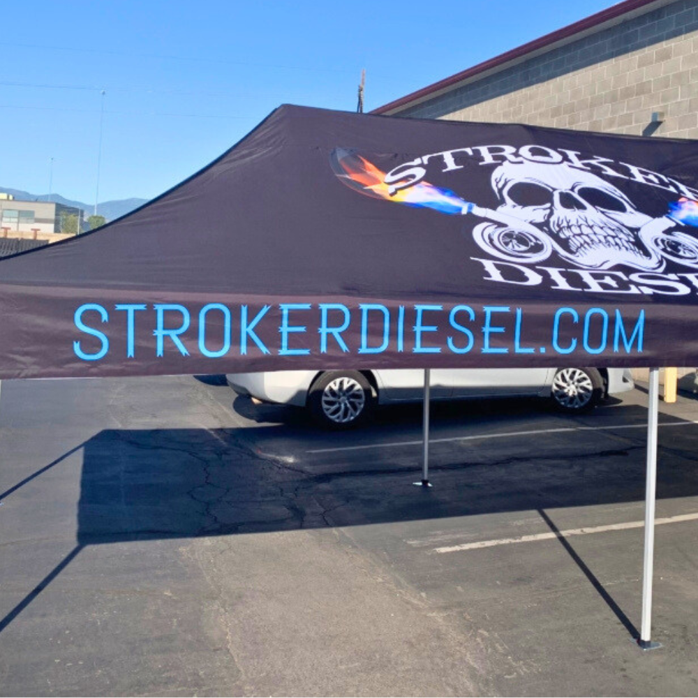
Valance (top border): This is your primary branding location. The valance wraps around three sides of your tent and sits at eye level for standing adults. Your business name and logo should dominate this space.
Back wall: If your tent has a back wall, place your logo large and centered. This creates a professional backdrop for product displays and gives approaching customers a clear view of your brand.
Side panels: Use these for secondary messaging like services offered, contact information, or product categories. Don’t clutter them with multiple small logos.
Color Contrast Matters More Than You Think
Brilliant logo colors mean nothing if they blend into your tent background. A red logo on an orange tent looks muddy from a distance. A navy logo on black disappears completely.
Your logo needs high contrast with the tent fabric. White or yellow text on dark backgrounds works well. Dark text on white or light-colored tents provides excellent visibility. Avoid medium tones that don’t pop.
We use a simple test at JC Pro Design: convert your design mockup to grayscale. If your logo still stands out clearly in black and white, your color contrast is strong enough.
Common Logo Placement Mistakes
Placing logos too low: Logos positioned below 5 feet get blocked by tables, products, and crowds. Keep primary branding in the top third of your tent.
Using multiple small logos: Three small logos scattered across your tent look cluttered and confuse viewers. One large logo beats several small ones.
Forgetting the back: Many vendors only brand the front valance, leaving the back and sides blank. People approach your booth from all angles at outdoor events.
Text-heavy designs: Your canopy isn’t a billboard for paragraphs. Stick to your business name, logo, and one short tagline maximum.
Print Quality Makes the Difference
Logo size and placement don’t matter if your printing looks pixelated or colors fade after three events. Professional dye-sublimation printing produces vibrant, durable graphics that withstand sun exposure and repeated setup.
At JC Pro Design, we print custom canopy tents in our Salt Lake City facility using commercial-grade equipment and UV-resistant inks. This ensures your logo looks sharp from the first event through years of outdoor use.
Ready to create a custom canopy tent that actually gets noticed at your next outdoor event? Contact JC Pro Design for a free consultation on logo optimization and tent design for maximum visibility.

