5 Logo Design Mistakes That Ruin Custom Embroidery (And How to Fix Them)
You’ve invested in a professional logo design for your business. It looks perfect on your business cards, website, and marketing materials. But when you try to get it embroidered on polo shirts or hats, something goes wrong. The details disappear, the colors look muddy, or the entire design just looks cheap and unprofessional.
This scenario plays out daily for businesses seeking custom embroidery in Salt Lake City, Utah. The problem isn’t your logo designer or your embroidery shop—it’s that logo design and embroidery are two completely different mediums with different rules. What works perfectly in print or digital often fails spectacularly when translated to thread and fabric.
At JC Pro Design, we’ve seen hundreds of logos that needed adjustments before they could be successfully embroidered. Here are the five most common logo design mistakes that ruin custom embroidery projects, and more importantly, how to fix them.
Mistake #1: Too Many Fine Details and Small Elements
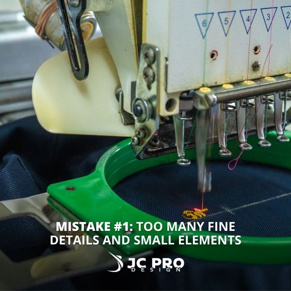
The Problem: Your logo looks pretty good 2 inches away on a business card, but embroidery thread is much thicker than ink on paper. Details smaller than 2-3mm simply disappear or become an unreadable blob when embroidered.
Common Examples:
- Thin lines in company names or graphics
- Small decorative flourishes
- Intricate patterns or textures
- Fine text under 8-point size
The Fix: Simplify your design for embroidery. Remove unnecessary details, thicken thin lines, and ensure all text is at least 8-point size. Create an “embroidery version” of your logo that maintains the brand essence while working within thread limitations.
Pro Tip: If your logo has both text and a symbol, consider using just the symbol for small embroidered applications like hat fronts or shirt pockets.
Mistake #2: Poor Color Choices for Fabric Applications
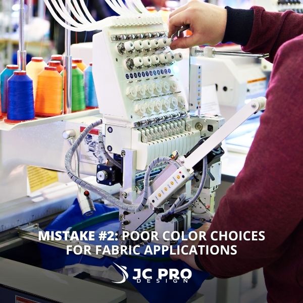
The Problem: Colors that pop on your computer screen or printed materials can look completely different when embroidered, especially on colored garments. Some color combinations become nearly invisible or create muddy appearances.
Color Issues to Avoid:
- Light colors on white or light garments
- Colors that are too similar in value
- Colors that clash with your typical garment choices
The Fix: Work with your embroidery shop to select thread colors that provide strong contrast against your chosen garment colors. Consider how your logo will look on both light and dark fabrics. Sometimes a single color version of your logo works better than full-color embroidery.
Local Advantage: JC Pro Design has an extensive thread color library and experience matching brand colors to available embroidery threads for the best possible results.
Mistake #3: Gradients and Complex Shading
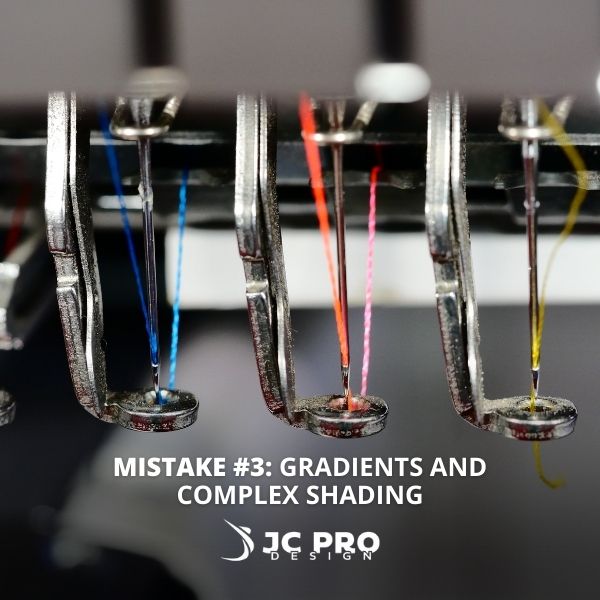
The Problem: Embroidery thread is a solid color medium. Those smooth gradients and subtle shadow effects in your logo simply cannot be reproduced with thread. Attempting to recreate them could result in choppy, unprofessional-looking embroidery.
What Doesn’t Work:
- Gradient fills
- Drop shadows
- Photographic elements
- Complex shading or highlights
The Fix: Convert gradients to solid colors or remove them entirely. Replace drop shadows with solid outline effects. Simplify any photographic elements to basic shapes. Think “flat design” rather than dimensional effects.
Mistake #4: Wrong Text Font Choices
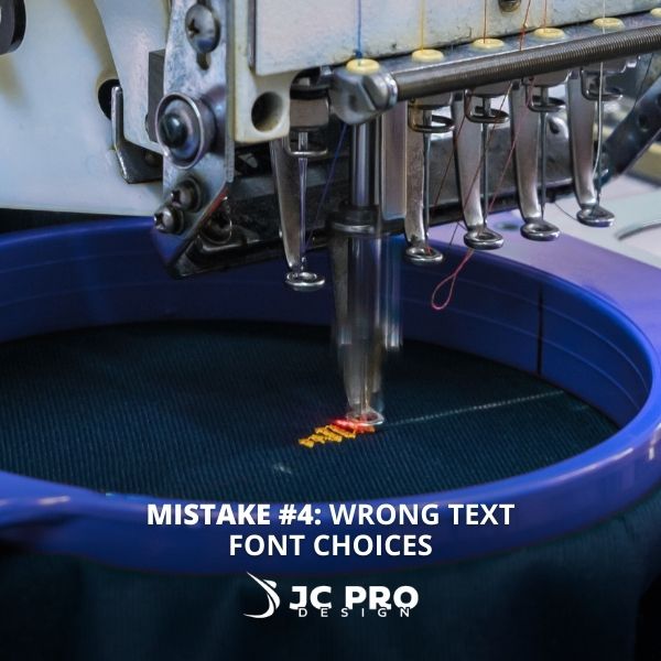
The Problem: Decorative fonts, script fonts, and fonts with very thin or very thick elements don’t embroider well. What looks elegant in print becomes unreadable or distorted when stitched.
Fonts That Cause Problems:
- Script or handwritten fonts
- Fonts with very thin strokes
- Condensed or compressed fonts
- Fonts with decorative serifs
The Fix: Choose clean, bold fonts with consistent stroke widths. Sans-serif fonts generally embroider better than serif fonts. If your brand requires a script font, work with your embroidery digitizer to modify it for better stitching.
Mistake #5: Ignoring Size and Placement Limitations
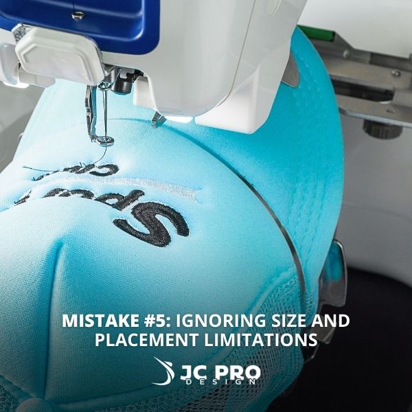
The Problem: Your logo might look perfect at large sizes, but most embroidered applications are much smaller. A complex logo that works great on a large banner becomes unreadable when shrunk down to fit on a polo shirt pocket.
Size Reality Check:
- Polo shirt pocket: 3-4 inches maximum
- Hat fronts: 2.25 inches tall and 5 inches wide maximum
- Shirt sleeves: 2-3 inches maximum
- Full chest placement: 4-9 inches maximum
The Fix: Design with the end application in mind. Create scalable versions of your logo. For very small applications, consider using just initials or a simplified icon version of your brand mark.
Your logo doesn’t have to look cheap when embroidered. The key is understanding the medium and working with professionals who can adapt your design appropriately.
At JC Pro Design, we’ve earned recognition as Utah’s Best Bespoke Screen Printer & Embroidery Company 2025 by paying attention to these details. We work with businesses throughout Salt Lake to ensure their embroidered apparel looks as professional as their brand deserves.
Before your next custom embroidery project, review your logo against these five common mistakes. A few simple adjustments can make the difference between professional-looking branded apparel and embroidery that undermines your business image.
Ready to see how your logo will look embroidered? Contact JC Pro Design for a consultation. We’ll review your logo and provide honest feedback on any modifications needed for successful custom embroidery.

